
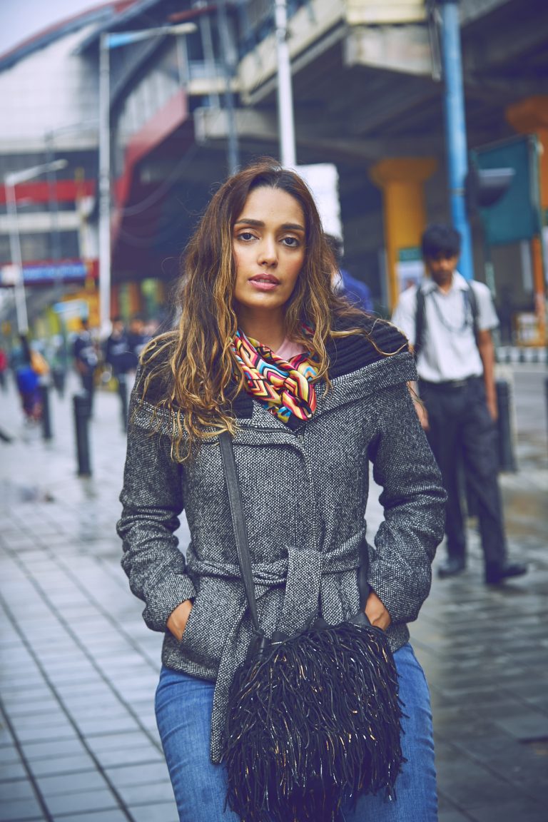
What do you do when you find yourself standing in front of your wardrobe staring at nothingness??? All the fabrics, prints and colors you see are not making sense to you any longer because dude you’re just hit by the most common syndrome I-have-nothing-to-wear. What Next??
You got two options :
- You go shopping.
- You go smart.
You would undoubtedly pick the first option. As much as I would love walking out of stores with bags , this day I decided to take up the challenge of going sensibly smart. I opted for the tricky challenge of mixing and matching prints. While I was at this task, I churned out 4 brand new looks from THAT very wardrobe of supposed nothingness. Wink wink!
But hey because I didn’t want to look like I got dressed in the dark here are some of the things I kept in mind when playing mash up with prints and patterns.
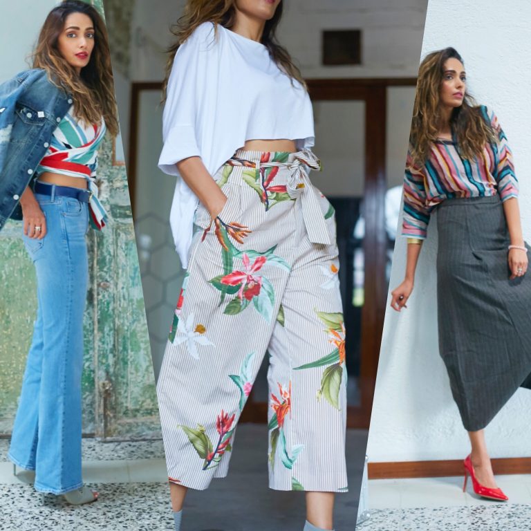
#1. Keep it Minimal

The idea is to play with prints without crowding them. In this look, I focused on how I want to style this chic sangria red crop top. I teamed this floral crop top with a less dominating abstract print wrap-a-round skirt that I got home from my Bali trip. It was from one of those cute Australian boutiques I walked in at Seminyak Street. When put together, these pieces actually created some magic. This look oozes out a fresh vibe and works perfect for Spring summer. Keeping it minimal, I styled my outfit with super comfortable suede ankle boots. I like to call this the free spirit boho look.

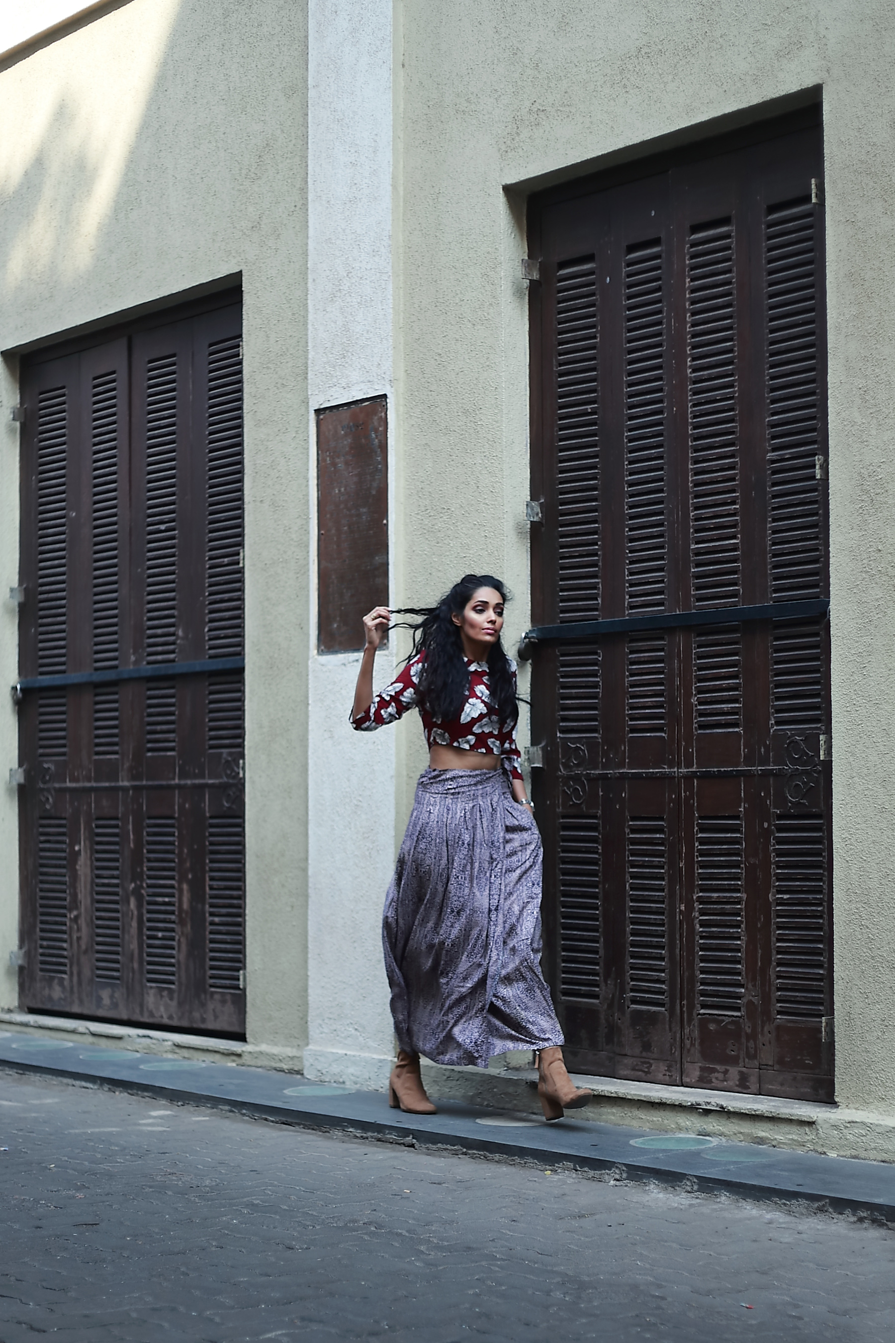


Crop Top : Lemon Chillo | Skirt : Bali | Boots : Zara
#2 : Use Accessory wisely

When accessorizing your pinstripe jacket or ikat dress, keep in mind that the focus of the outfit is the pattern not the accessory. Be it a belt, shoe or scarf, accessories can overwhelm or balance an outfit. So choose wisely. Spring summers are meant for dainty silk scarves hence I opted to style my monochrome oversized blazer with this geometric pattern scarf. I draped it in a halter style blouse over the jacket.
( you may choose to drape your scarf the traditional way over a shirt or top of the same color family)
Both, the stripes and geometric print amalgamate with so much ease without making it look chaotic. It’s understatedly chic!


Scarf : Burberry | Jacket : H&M | Jeans : Splash | Shoes: Call It Spring
#3 : Mix patterns from the same color family.

Using hues from one main color when mixing patterns can create a very subtle look, while still showing your daring side. It’s still visually stimulating for the eye, but in a refined way. For this look, mint green and white were my focus point. I teamed my Moroccan tribal patterned pencil skirt with a floral slip top. I love how the two patterns blend so beautifully with each other almost making it so seamless. Adding something solid like this white breezy jacket and mint green stilettos over these patterns allow the visual space of the outfit to be broken up. You can do this with a handbag, shoes, accessories or another article of clothing. Whatever you chose to add, it’ll help your outfit look even better.


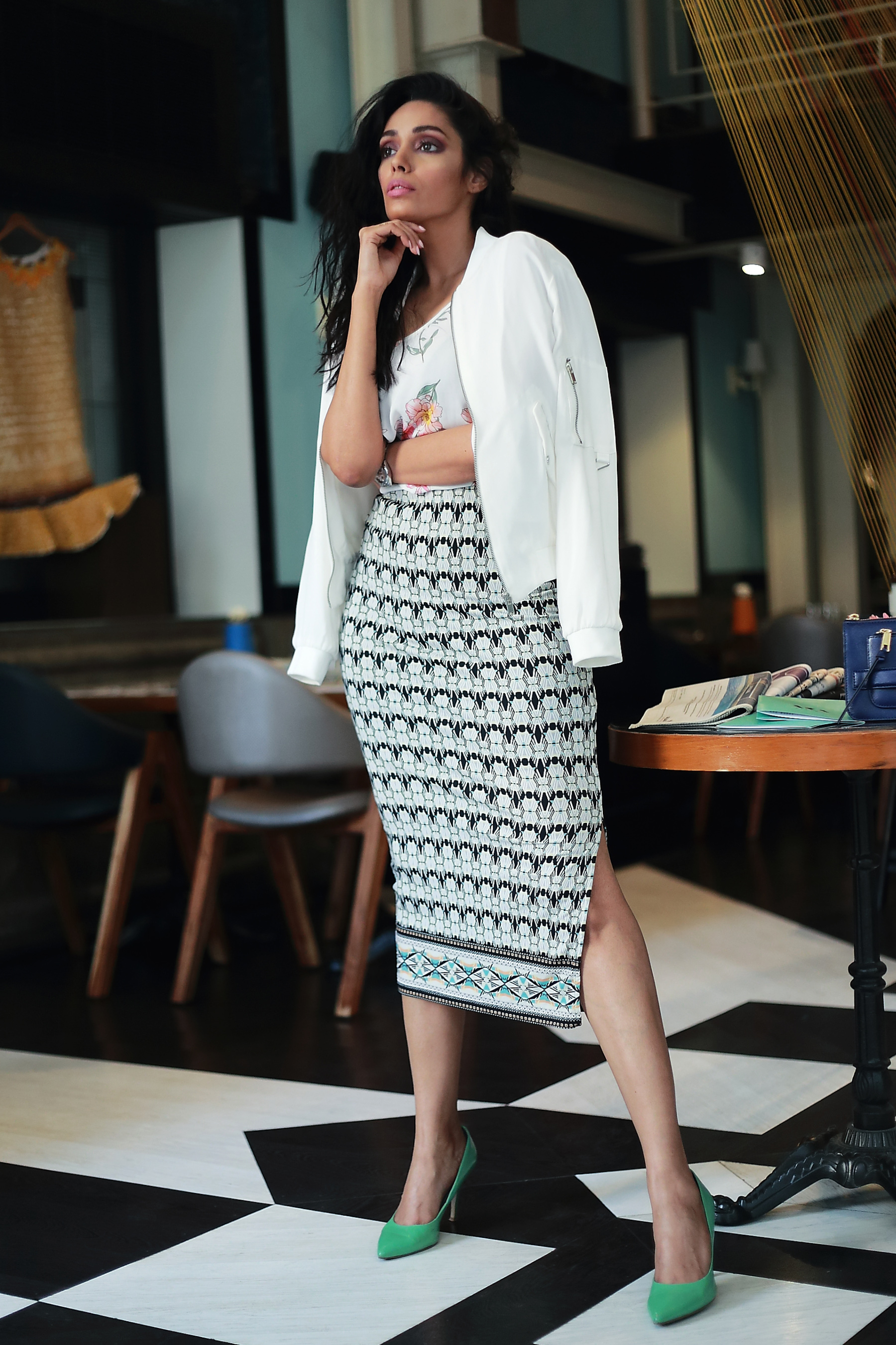
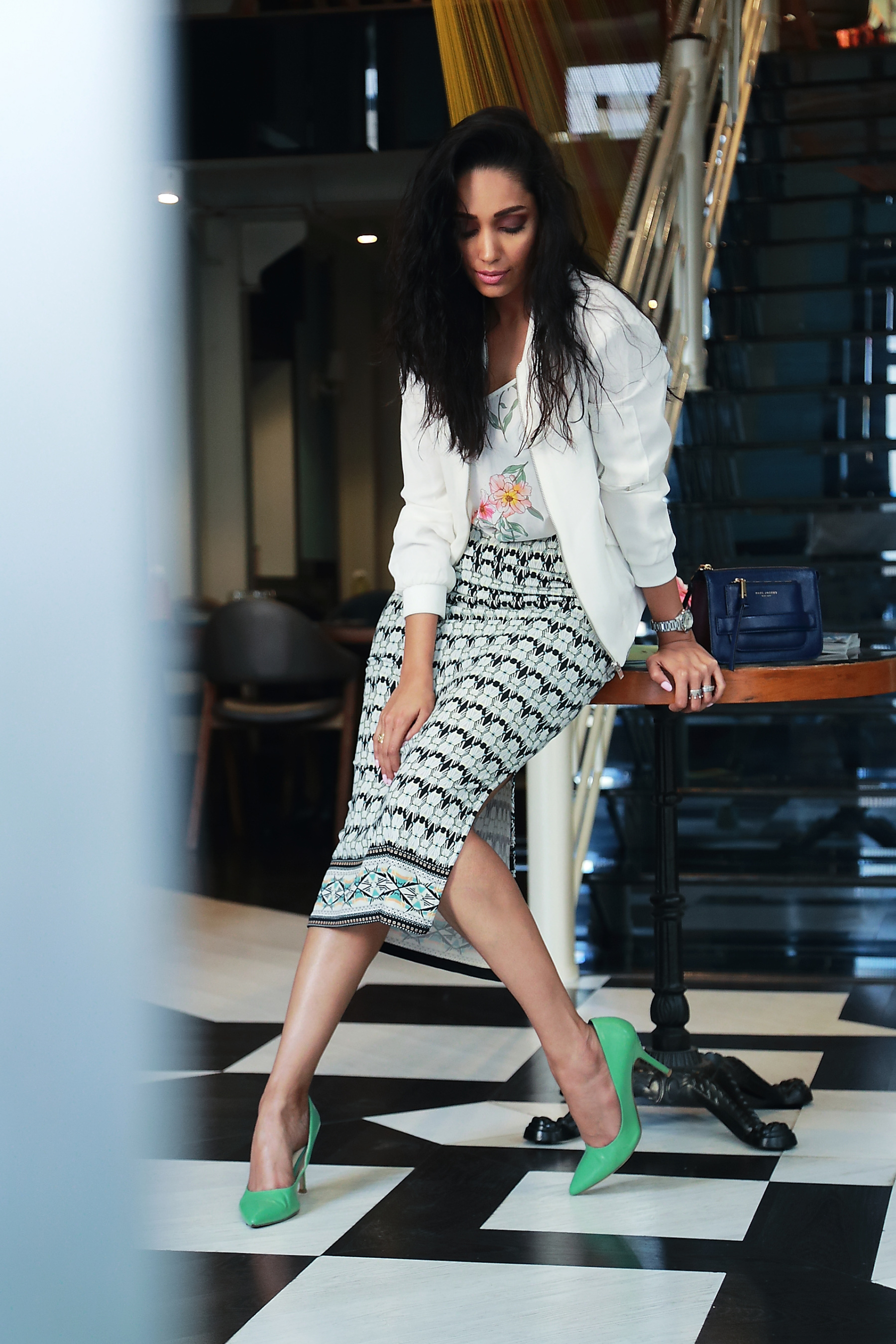
Skirt : Warehouse-London | Slip top : Forever21 | Jacket : Zara | Shoes : Dorothy Perkin |
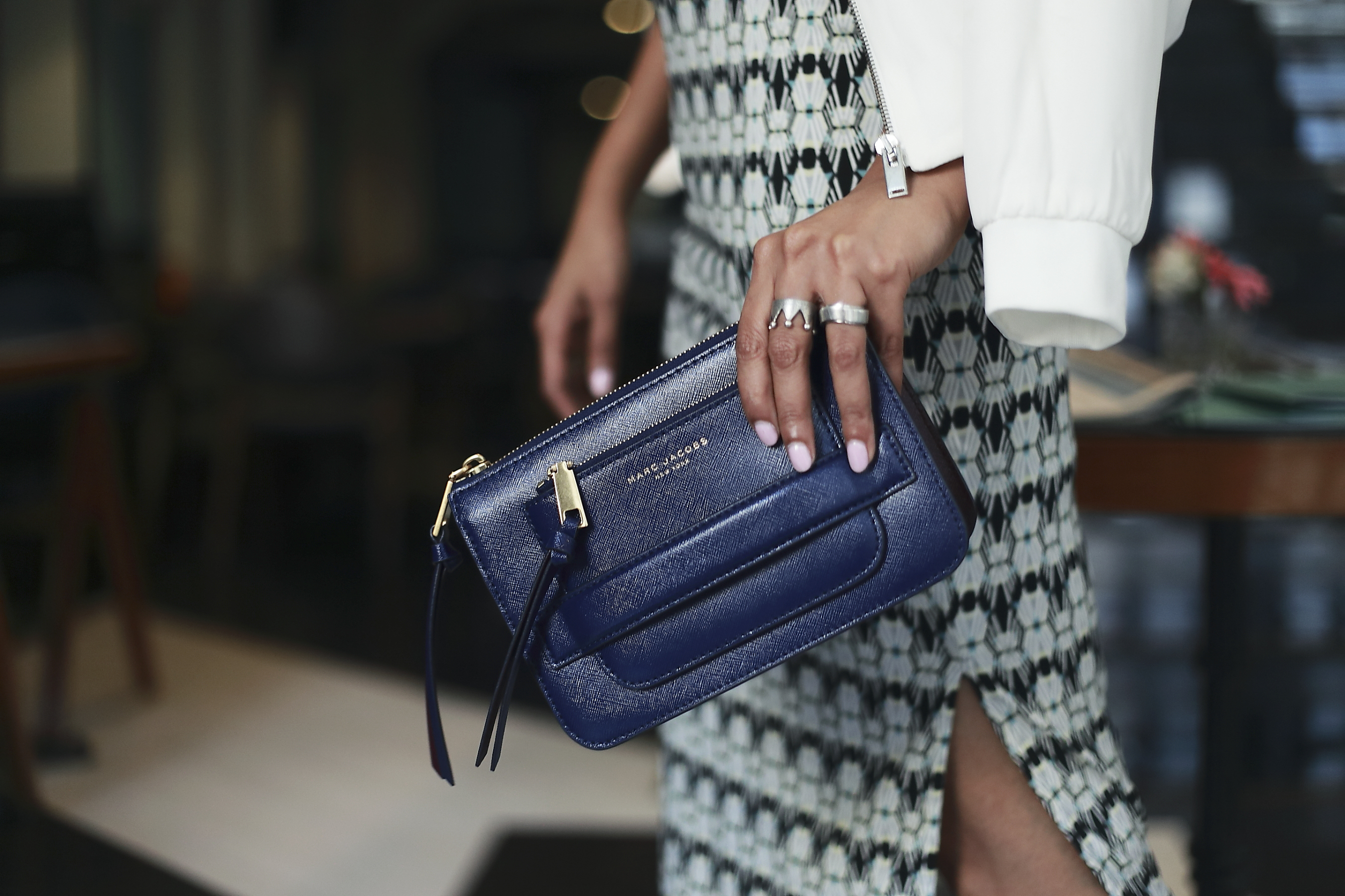
Clutch : Marc Jacob | Watch : Tag Heuer
#4 : Look for patterns that complement each other

Everybody loves the classic pinstripe and plaid pattern! Each season designers try and reinvent these classic prints in their new collection.
(Some of the other patterns that can be meshed up are Stripes+floral, polka dot+stripes, animal print+ stripes etc. )
Plaid is often thought of as a winter staple print but not in my books. This spring summer you will see me a lot in these cotton well fitted plaid print pants that work so well with stripes. Believe it or not, stripes match everything from paisley to ikat to polka dots, so when in doubt, let them be your fallback.
I accessorized this look with my current favorite – the medusa head belt and pointed heels.
Did I just hear you say #GirlBoss ?

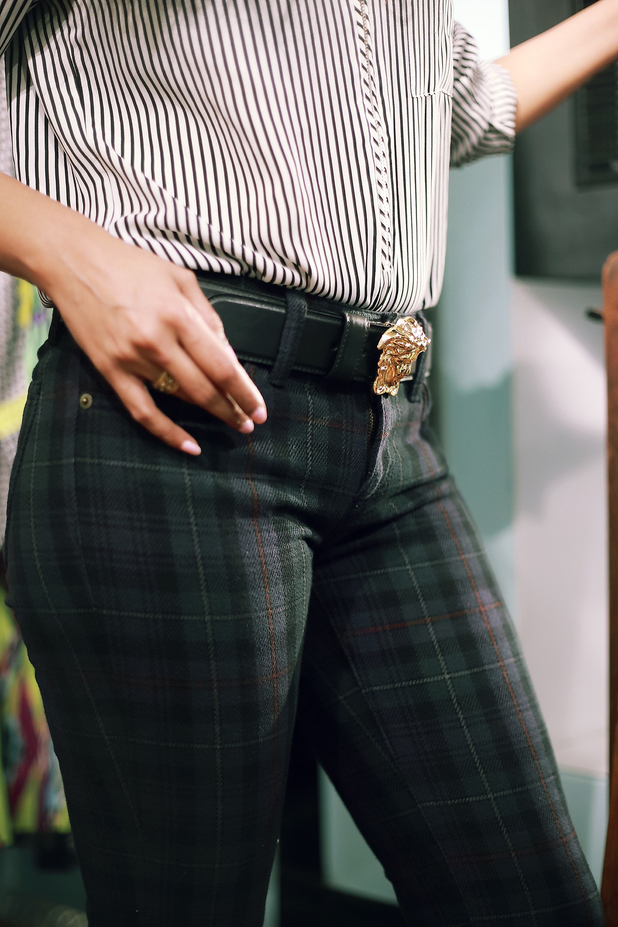


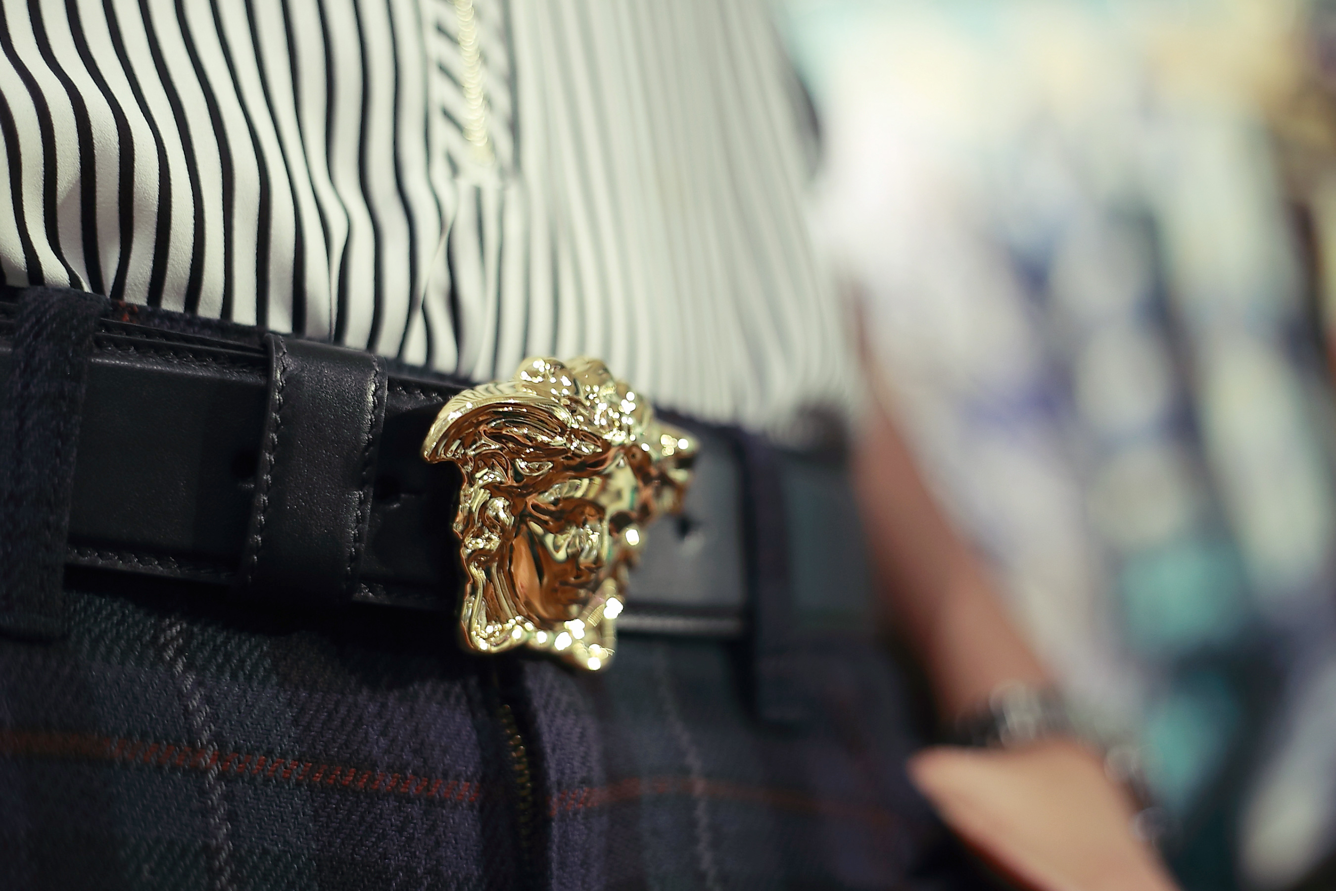
Pants : Ralph Lauren | Shirt : Dynamite | Belt : Versace | Shoes: Dorothy Perkin | Watch : Tag Heuer
Location Courtesy : AKA Bistro
Photography By Mrinmai Parab
P.S :


Comments ( 0 )